MORE BUZZ
User engagement and adoption
APP
SAAS
B2B
B2C

Overview
Company
Grupo Asserth – More Buzz
Time
4 months
Teams
Commercial, Marketing, Backend e Frontend
Company
Grupo Asserth – More Buzz
Time
4 months
Teams
Commercial, Marketing, Backend e Frontend
About More Buzz
Specialized in business ecosystems, it offers through its web application a complete solution to transform product and service indications into sales. The goal is to create new opportunities for dissemination and revenue generation for companies by connecting promoters, customer service and consumers on the same platform.
Goal
Increase user adoption and engagement on the product.
Initial problem
The user experience (UX) in the web application presented information architecture and naming problems that posed a challenge to increasing user adoption and engagement.
Challenges
Responsiveness
Adapt the web application to offer consistent browsing on different screen sizes.
Hybrid app
Create a mobile version for Android and iOS, while maintaining consistency with the web experience.
White label
Define a neutral visual and textual language, flexible enough to adapt to different brands.
Pattern and consistency
Create design patterns to reduce inconsistencies, speed up development, and facilitate product evolution.
User and business
Bring the solution closer to the needs of users, balancing usability, context of use and business objectives.
Pattern and consistency
Create design patterns to reduce inconsistencies, speed up development, and facilitate product evolution.
User and business
Bring the solution closer to the needs of users, balancing usability, context of use and business objectives.
Service Blueprint
To deepen my knowledge about the business and understand how each persona interacts with it, I created a Service Blueprint. This made it possible to understand internal processes, promote alignment between areas and identify opportunities for improvement. This mapping connected the user's view to the operations of the business, providing clarity to guide design decisions.

Personas
From the Service Blueprint, we identified four main user profiles that use the More Buzz web app.
A partir do Service Blueprint, identificamos quatro perfis de usuários principais que utilizam o web app da More Buzz.
Corporate (B2B)
Owner of the ecosystem, he follows the profit generated by the sales of his products and services that are indicated by the promoters.
Attendant
It supports the service of customers who want to buy products and services indicated by the promoters using the CRM version.
Corporate (B2B)
Owner of the ecosystem, he follows the profit generated by the sales of his products and services that are indicated by the promoters.
Attendant
It supports the service of customers who want to buy products and services indicated by the promoters using the CRM version.
Common Promoter
It indicates products and services, but cannot register other promoters. Receive cash rewards only for your own referrals.
Promoter Pro
It indicates products and services and can register common promoters. It receives cash rewards for its own referrals and also for the referrals made by its promoters.
UX Audit
After understanding the business and the personas, I mapped and analyzed in detail the screens and flows of the current web app in the view of each persona, in order to identify usability problems. This step was essential to mitigate already known risks and discover new problems.More than 60 problems were found, most of them related to information hierarchy and inconsistency.

Main problem found
Principais problemas
" width="26.000001144409225px"><path d="M 7.8 23.684 L 7.8 11.842 M 10.4 6.579 C 13.272 6.579 15.6 8.935 15.6 11.842 L 15.6 15.789 C 15.6 20.15 12.108 23.684 7.8 23.684 C 3.492 23.684 0 20.15 0 15.789 L 0 11.842 C 0 8.935 2.328 6.579 5.2 6.579 Z M 10.556 2.474 L 13 0" fill="transparent" height="23.684210701992637px" id="fQVlUgxfl" stroke-dasharray="" stroke-linecap="round" stroke-linejoin="round" stroke-width="2.5" stroke="rgb(194, 40, 32)" transform="translate(5.2 0)" width="15.599999999999909px"/><path d="M 24.7 25 C 24.703 22.188 22.522 19.87 19.747 19.737 M 24.7 3.947 C 24.697 6.623 22.711 8.87 20.085 9.171 M 26 14.474 L 20.8 14.474 M 1.3 25 C 1.297 22.188 3.478 19.87 6.253 19.737 M 1.3 3.947 C 1.303 6.623 3.289 8.87 5.915 9.171 M 5.2 14.474 L 0 14.474 M 7.8 0 L 10.244 2.474 M 9.1 6.75 L 9.1 5.263 C 9.1 3.083 10.846 1.316 13 1.316 C 15.154 1.316 16.9 3.083 16.9 5.263 L 16.9 6.75" fill="transparent" height="25.000001003867702px" id="jPFN9D6UH" stroke-dasharray="" stroke-linecap="round" stroke-linejoin="round" stroke-width="2.5" stroke="rgb(194, 40, 32)" width="26.000001144409225px"/></g></svg>)
Confusing texts
Labels, buttons, and messages don't accurately communicate what the user should do or what the outcome of the action will be.
Confusing architecture
Important information appears mixed, hidden, or distributed in unintuitive structures.
Weak hierarchy
Some pages do not make it clear where the user is, what the purpose of the screen is, or what deserves more attention.
Unexpected interactions
Some components have unexpected behaviors, making the experience less predictable and more error-prone.
Hidden information
Important data for decision or continuation of the journey appear in the background or at the wrong time.
Complex flows
Some flows require unnecessary clicks, hide relevant information, or don't provide adequate feedback.
Benchmarking
Conducted a competitor analysis to understand best practices and opportunities for differentiation. The study revealed three important aspects related to the autonomy, notifications and transparency of competing platforms.

Main discoveries
Autonomy
Competitors allow you to set up referral programs and personalize messages.
Notifications
Robust notification systems increase engagement and reduce churn.
Transparency
Referrals are updated in real time, building trust and engagement.
Autonomy
Competitors allow you to set up referral programs and personalize messages.
Notifications
Robust notification systems increase engagement and reduce churn.
Transparency
Referrals are updated in real time, building trust and engagement.
Prototyping
After consolidating the learnings about business, users, current application and market, I started planning the solution by creating a low-fidelity prototype of the web app. To do this, I led co-creation sessions with different specialties, which allowed me to consider the needs and rules of the business, align communication with the brand identity and respect technical limitations of backend and frontend.
More than 60 hours were invested in building low-fidelity wireframes, ensuring that the new version of the product solved the problems identified in the previous stages.

Usability Testing
After the prototype of the new version was validated internally, I conducted 5 remote and moderated tests with real users to evaluate the usability.
We concluded that the new version of the product proved to be solid, but specific adjustments in nomenclatures, information architecture, and visibility of key elements were considered essential to make the experience more intuitive and aligned with the users' mental model.


User reviews
I felt difficulty with the business statuses, with the New status.
The link to attract promoters could be easier, for example on the home screen.
I found it a little confusing. Some parts are not so easy to understand.
I felt difficulty with the business statuses, with the New status.
The link to attract promoters could be easier, for example on the home screen.
I found it a little confusing. Some parts are not so easy to understand.
Style Guide
I created a style guide with the primary visual elements of the product. The guide established a standardized visual foundation for the creation of the interface design, ensuring consistency and scalability from the beginning of design planning through development.


Colors
Black
Black
color brand
Used as a neutral base of the interface, bringing structure, readability and visual balance.
Yellow
Yellow
brand color
Highlights the primary actions of the interface and directs the user's attention to the main points of interaction.
Error
Error
cor semântica
Indicates failures, problems, or actions that require correction.
Attention
Attention
semantic color
Signals situations that require care before continuing.
Informative
Informative
semantic color
Communicates guidance, updates, or neutral messages of support.
Success
Success
semantic color
Used to confirm that an action completed correctly.
Scalable, responsive component libraryand consistent
Using the primary visual elements of the style guide, I created more complex and reusable components that sped up development and ensured visual consistency. This step also reinforced the scalability of the product, making future evolutions more agile.

Toast
Mensagem breve e temporária usada para confirmar ações, informar mudanças de estado ou alertar o usuário sem interromper sua jornada.
Status
Positivo
Mensagem positiva
Banner
Componente de destaque usado para comunicar informações importantes, avisos ou oportunidades dentro do contexto da tela.
Status
Positivo
Título
Mensagem que confirma uma ação bem-sucedida ou destaca uma informação favorável para o usuário.
Label da ação
Toast
Brief, temporary message used to confirm actions, report state changes, or alert the user without interrupting their journey.
State
Positive
Mensagem positiva
Banner
Highlighting component used to communicate important information, notices, or opportunities within the context of the screen.
State
Positive
Título
Mensagem que confirma uma ação bem-sucedida ou destaca uma informação favorável para o usuário.
Label da ação
Botão
Elemento de ação que orienta o usuário sobre o próximo passo, como confirmar, continuar, salvar, cancelar ou iniciar uma tarefa.
Variação
Label
Clique aqui
GRANDE
Clique aqui
MÉDIO
Clique aqui
PEQUENO
Badge
Usado para destacar status, categorias, notificações ou informações complementares, ajudando o usuário a identificar estados importantes.
Status
Notificação
Label
GRANDE
Label
MÉDIO
Label
PEQUENO
MÍNIMO
Button
An action element that guides the user through the next step, such as confirming, continuing, saving, canceling, or starting a task.
Variable
Label
Clique aqui
LARGE
Clique aqui
MEDIUM
Clique aqui
SMALL
Badge
Used to highlight statuses, categories, notifications, or supplemental information, helping the user identify important states.
State
Notification
Label
LARGE
Label
MEDIUM
Label
SMALL
MINIMAL
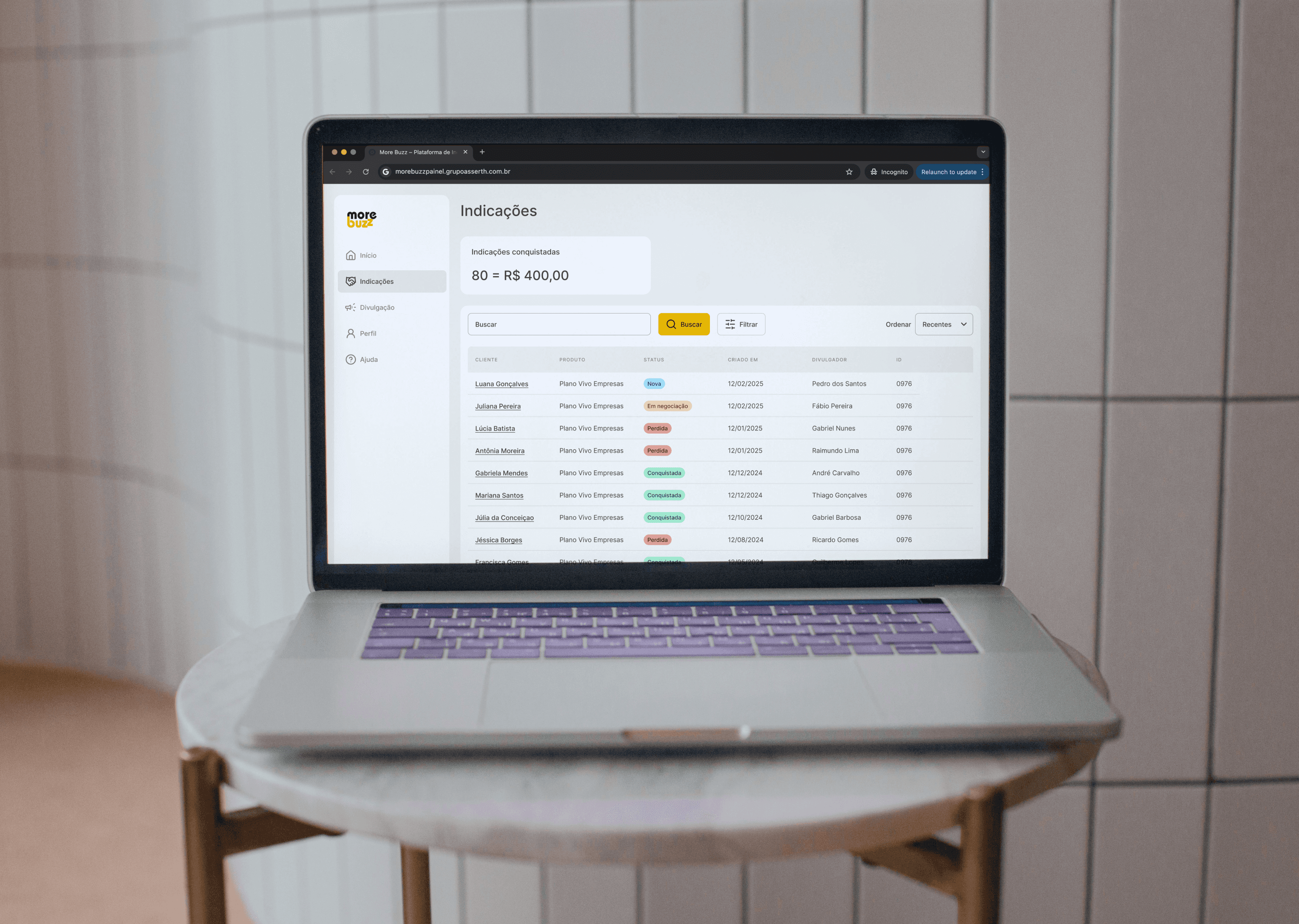
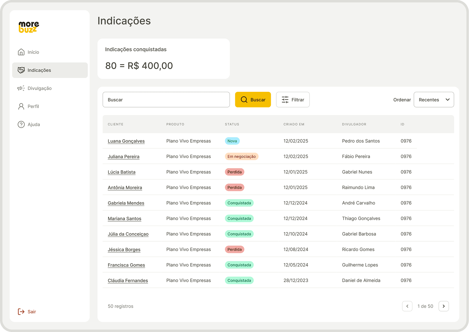
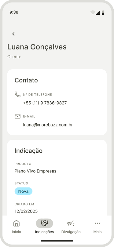
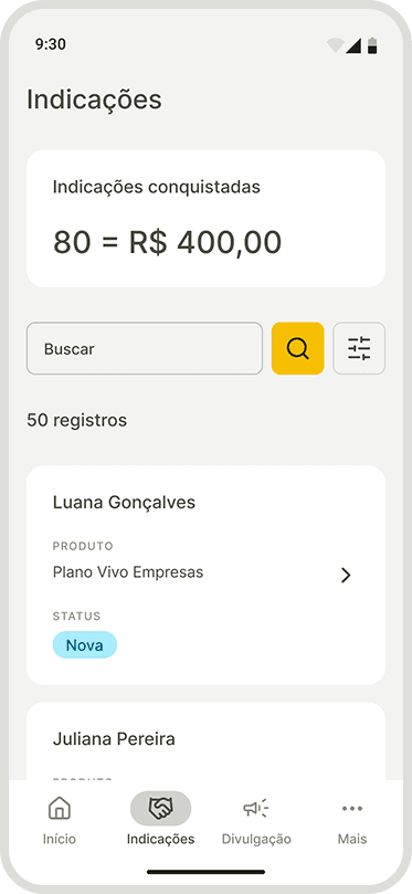
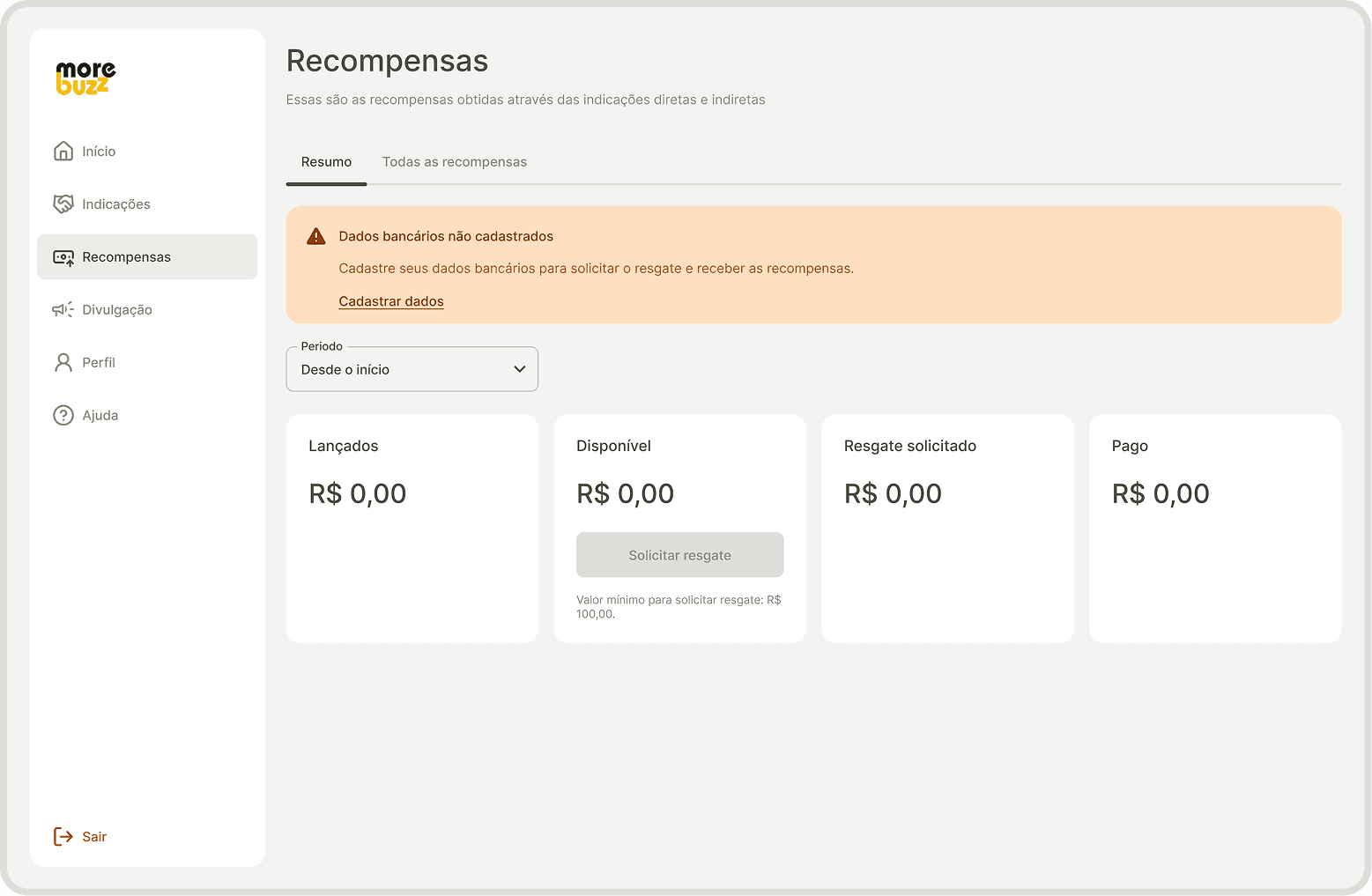
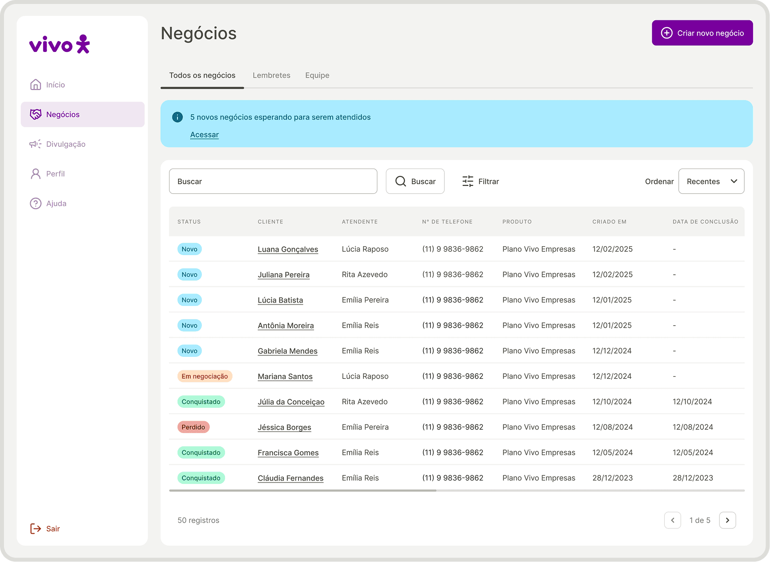
Navigation bar
Estrutura de navegação que organiza os principais destinos do app, permitindo que o usuário se mova com clareza entre áreas importantes da experiência.
Dispositivo
" height="20.833375000000004px" id="uFangEaQL" transform="translate(9.583 9.583)" width="20.83337499999999px"/></g></svg>)
Desktop
Mobile
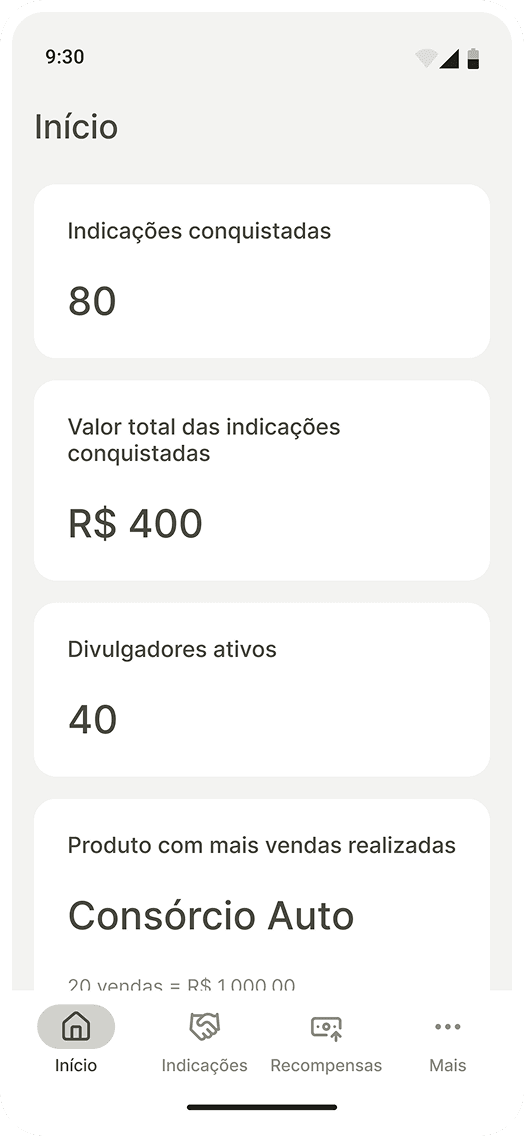
Início
Indicações
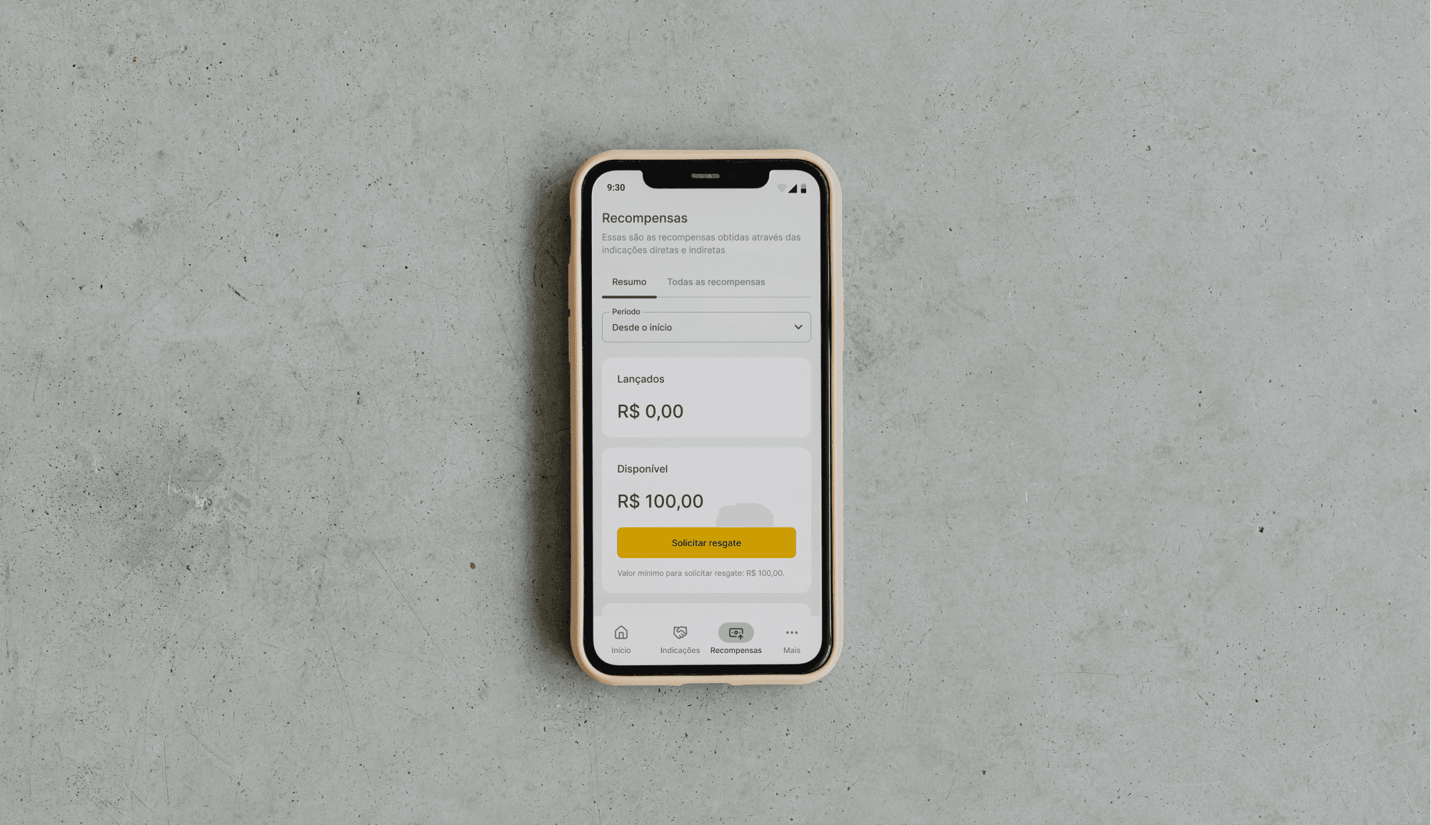
Recompensas
Divulgação
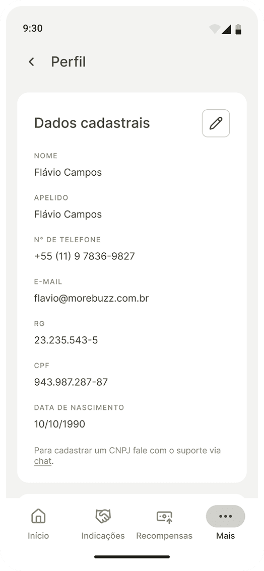
Perfil
Ajuda
" transform="translate(4 4)" width="32.000001483493406px"/></svg>)
Sair
Navigation bar
A navigation structure that organizes your app's top destinations, allowing the user to move clearly between important areas of the experience.
Device
Desktop
Mobile
Início
Indicações
Recompensas
Divulgação
Perfil
Ajuda
Sair


Results
" transform="translate(5 13.337)" width="16.666714285714274px"/><path d="M 0 3.333 C 0 2.449 0.351 1.601 0.976 0.976 C 1.601 0.351 2.449 0 3.333 0 L 23.333 0 C 24.217 0 25.065 0.351 25.69 0.976 C 26.315 1.601 26.667 2.449 26.667 3.333 L 26.667 30 C 26.667 30.884 26.315 31.732 25.69 32.357 C 25.065 32.982 24.217 33.333 23.333 33.333 L 19.333 33.333" fill="transparent" height="33.333371428571425px" id="eWBBEVlhU" stroke-dasharray="" stroke-linecap="round" stroke-linejoin="round" stroke-width="2.86" stroke="rgb(13, 150, 88)" transform="translate(8.328 3.337)" width="26.666599999999953px"/><path d="M 0 0 L 0.017 0" fill="transparent" height="1px" id="viXPxUcla" stroke-dasharray="" stroke-linecap="round" stroke-linejoin="round" stroke-width="2.86" stroke="rgb(13, 150, 88)" transform="translate(13.328 30)" width="1px"/></svg>)
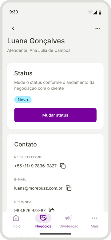
Responsiveness
The experience was adapted to mobile without losing consistency with the web environment.
" transform="translate(6.672 3.337)" width="26.66672857142853px"/><path d="M 0 0 L 0 6.667 C 0 7.551 0.351 8.399 0.976 9.024 C 1.601 9.649 2.449 10 3.333 10 L 10 10" fill="transparent" height="10px" id="sdLa4WDbh" stroke-dasharray="" stroke-linecap="round" stroke-linejoin="round" stroke-width="2.86" stroke="rgb(13, 150, 88)" transform="translate(23.328 3.337)" width="10.000000000000004px"/><path d="M 0 3.333 L 3.333 6.667 L 10 0" fill="transparent" height="6.666571428571434px" id="Wfvq4VyLJ" stroke-dasharray="" stroke-linecap="round" stroke-linejoin="round" stroke-width="2.86" stroke="rgb(13, 150, 88)" transform="translate(5 21.663)" width="10px"/></svg>)
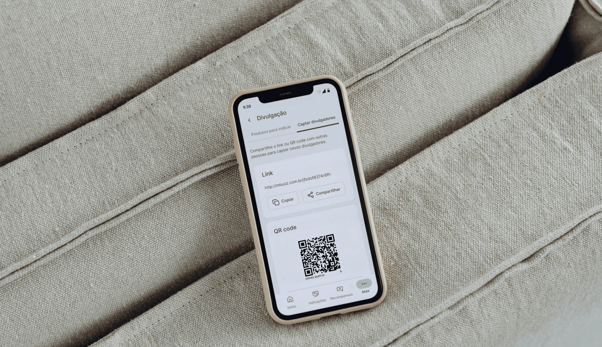
White label
The product has been rebuilt with a neutral visual and textual language to make it possible for other brands to use.
" transform="translate(20 5)" width="13.33328571428573px"/><path d="M 0 1.667 C 1.238 0.738 2.71 0.173 4.252 0.034 C 5.793 -0.105 7.343 0.188 8.727 0.88 C 10.111 1.572 11.275 2.636 12.089 3.952 C 12.902 5.269 13.333 6.786 13.333 8.333 C 12.095 9.262 10.623 9.827 9.082 9.966 C 7.54 10.105 5.991 9.812 4.607 9.12 C 3.222 8.428 2.058 7.364 1.245 6.048 C 0.431 4.731 0 3.214 0 1.667 Z" fill="transparent" height="10.000058285943764px" id="YR4gsRj8U" stroke-dasharray="" stroke-linecap="round" stroke-linejoin="round" stroke-width="2.86" stroke="rgb(13, 150, 88)" transform="translate(6.672 13.337)" width="13.333299999999978px"/><path d="M 0 0 L 23.333 0" fill="transparent" height="1px" id="RYyMfktGE" stroke-dasharray="" stroke-linecap="round" stroke-linejoin="round" stroke-width="2.86" stroke="rgb(13, 150, 88)" transform="translate(8.328 35)" width="23.33327142857148px"/></svg>)
Scalable consistency
The style guide and components have created a design foundation that facilitates maintenance and future evolution.
" transform="translate(3.328 25)" width="23.33327142857148px"/><path d="M 0 0 C 1.43 0.371 2.696 1.205 3.599 2.373 C 4.503 3.541 4.994 4.976 4.994 6.453 C 4.994 7.93 4.503 9.365 3.599 10.533 C 2.696 11.701 1.43 12.536 0 12.907" fill="transparent" height="12.906657142857142px" id="a0GeKo9VD" stroke-dasharray="" stroke-linecap="round" stroke-linejoin="round" stroke-width="2.86" stroke="rgb(13, 150, 88)" transform="translate(26.672 5.218)" width="4.9937142857142405px"/><path d="M 5 9.783 L 5 6.45 C 4.999 4.973 4.507 3.538 3.602 2.371 C 2.697 1.203 1.43 0.369 0 0" fill="transparent" height="9.783428571428573px" id="PN9IBkizY" stroke-dasharray="" stroke-linecap="round" stroke-linejoin="round" stroke-width="2.86" stroke="rgb(13, 150, 88)" transform="translate(31.672 25.218)" width="5.0000000000000036px"/><path d="M 6.667 13.333 C 10.349 13.333 13.333 10.349 13.333 6.667 C 13.333 2.985 10.349 0 6.667 0 C 2.985 0 0 2.985 0 6.667 C 0 10.349 2.985 13.333 6.667 13.333 Z" fill="transparent" height="13.333285714285715px" id="qotDcFucS" stroke-dasharray="" stroke-linecap="round" stroke-linejoin="round" stroke-width="2.86" stroke="rgb(13, 150, 88)" transform="translate(8.328 5)" width="13.333271428571477px"/></svg>)
User at the center
The tests revealed needs and expectations, making the product more aligned with the users' mental model.
Engagement and adoption
The new changes favored the increase, engagement and adoption of users in the product.
Back home
" width="12px"><path d="M 9.98 10.977 L 9.98 1.996 L 0.998 1.996 C 0.447 1.996 0 1.549 0 0.998 C 0 0.447 0.447 0 0.998 0 L 10.977 0 C 11.529 0 11.975 0.447 11.975 0.998 L 11.975 10.977 C 11.975 11.529 11.529 11.975 10.977 11.975 C 10.426 11.975 9.98 11.529 9.98 10.977 Z" fill="rgb(255, 255, 255)" height="11.975424446415929px" id="TAkCTIb4j" width="11.975424446416127px"/><path d="M 10.284 0.305 C 10.535 0.045 10.906 -0.059 11.255 0.033 C 11.604 0.124 11.876 0.396 11.967 0.745 C 12.059 1.094 11.955 1.465 11.695 1.716 L 1.716 11.695 C 1.465 11.955 1.094 12.059 0.745 11.967 C 0.396 11.876 0.124 11.604 0.033 11.255 C -0.059 10.906 0.045 10.535 0.305 10.284 Z" fill="rgb(255, 255, 255)" height="12px" id="meAnXRyQ2" width="12px"/></g></svg>)
Visão geral
Empresa
Grupo Asserth – More Buzz
Prazo
4 meses
Times envolvidos
Comercial, Marketing e Comunicação, Backend e Frontend
Sobre a More Buzz
Especializada em ecossistemas para negócios, oferece por meio do seu aplicativo web uma solução completa para transformar indicações de produtos e serviços em vendas. O objetivo é criar novas oportunidades de divulgação e geração de receita para empresas ao conectar divulgadores, atendimento ao cliente e consumidores em uma mesma plataforma.
Desafio
Aumentar a adoção e o engajamento dos usuários no produto.
Problema inicial
A experiência do usuário (UX) no aplicativo web apresentava problemas de arquitetura de informação e nomenclaturas que representavam um desafio para o aumento de adoção e engajamento dos usuários.
Desafios
Responsividade
Adaptar a aplicação web para oferecer uma navegação consistente em diferentes tamanhos de tela.
Aplicativo híbrido
Criar uma versão mobile para Android e iOS, mantendo a consistência com a experiência web.
White label
Definir uma linguagem visual e textual neutra, flexível o suficiente para se adaptar a diferentes marcas.
Responsividade
Criar padrões de design para reduzir inconsistências, acelerar desenvolvimento e facilitar a evolução do produto.
Aplicativo híbrido
Aproximar a solução das necessidades dos usuários, equilibrando usabilidade, contexto de uso e objetivos do negócio.
Service Blueprint
Para aprofundar o conhecimento sobre o negócio e entender como cada persona interage com ele, criei um Service Blueprint. Isso possibilitou compreender processos internos, promover alinhamento entre áreas e identificar oportunidades de melhoria. Esse mapeamento conectou a visão do usuário às operações do negócio, oferecendo clareza para orientar decisões de design.
Personas
A partir do Service Blueprint, identificamos quatro perfis de usuários principais que utilizam o web app da More Buzz.
Corporativo (B2B)
Dono do ecossistema, acompanha o lucro gerado pelas vendas de seus produtos e serviços que são indicados pelos divulgadores.
Atendente
Apoia no atendimento de clientes que querem comprar produtos e serviços indicados pelos divulgadores usando a versão CRM.
Divulgador Comum
Indica produtos e serviços, mas não pode cadastrar outros divulgadores. Recebe recompensas em dinheiro apenas por suas próprias indicações.
Divulgador Pro
Indica produtos e serviços e pode cadastrar divulgadores comuns. Recebe recompensas em dinheiro por suas próprias indicações e também pelas indicações feitas por seus divulgadores.
Auditoria de UX
Após entender o negócio e as personas, mapeei e analisei detalhadamente as telas e fluxos do web app atual na visão de cada persona, com o objetivo de identificar problemas de usabilidade. Essa etapa foi essencial para mitigar riscos já conhecidos e descobrir novos problemas.
Mais de 60 problemas foram encontrados, sendo a maioria deles relacionados à hierarquia de informação e inconsistência.
Principais problemas
Textos confusos
Labels, botões e mensagens não comunicam com precisão o que o usuário deve fazer ou qual será o resultado da ação.
Arquitetura confusa
Informações importantes aparecem misturadas, escondidas ou distribuídas em estruturas pouco intuitivas.
Hierarquia fraca
Algumas páginas não deixam claro onde o usuário está, qual é o objetivo da tela ou o que merece mais atenção.
Interações inesperadas
Alguns componentes têm comportamentos inesperados, tornando a experiência menos previsível e mais sujeita a erros.
Informações escondidas
Dados importantes para decisão ou continuidade da jornada aparecem em segundo plano ou no momento errado.
Fluxos complexos
Alguns fluxos exigem cliques desnecessários, escondem informações relevantes ou não oferecem feedback adequado.
Benchmarking
Realizei uma análise de concorrentes para compreender boas práticas e oportunidades de diferenciação. O estudo revelou três aspectos importantes relacionados à autonomia, notificações e transparência das plataformas concorrentes.
Principais descobertas
Autonomia
Concorrentes permitem configurar programas de indicação e personalizar mensagens.
Notificações
Sistemas robustos de notificação aumentam engajamento e reduzem churn.
Transparência
Indicações são atualizadas em tempo real, gerando confiança e engajamento.
Protótipo
Após consolidar os aprendizados sobre negócio, usuários, aplicativo atual e mercado, iniciei o planejamento da solução criando um protótipo em baixa fidelidade do web app. Para isso, liderei sessões de cocriação com diferentes especialidades, o que me permitiu considerar as necessidades e regras do negócio, alinhar a comunicação à identidade da marca e respeitar limitações técnicas de backend e frontend.
Foram investidas mais de 60 horas na construção de wireframes em baixa fidelidade, garantindo que a nova versão do produto resolvesse os problemas identificados nas etapas anteriores.
Teste de Usabilidade
Após o protótipo da nova versão ser validado internamente, conduzi 5 testes remoto e moderado com usuários reais para avaliar a usabilidade.
Concluímos que a nova versão do produto se mostrou sólida, mas ajustes pontuais em nomenclaturas, arquitetura da informação e visibilidade de elementos-chave foram considerados essenciais para tornar a experiência mais intuitiva e alinhada ao modelo mental dos usuários.
Comentários dos usuários
Senti dificuldade com os status dos negócios, com o status Novo.
O link de captação de divulgadores poderia estar mais fácil, por exemplo na tela inicial.
Achei um pouco confuso. Algumas partes não são tão fáceis de entender.
Guia de Estilo
Criei um guia de estilo com os elementos visuais primários do produto. O guia estabeleceu uma base visual padronizada para a criação do design de interface, garantindo consistência e escalabilidade desde o início do planejamento de design até o desenvolvimento.
Preto
cor da marca
Usado como base neutra da interface, trazendo estrutura, legibilidade e equilíbrio visual.
Amarelo
cor da marca
Destaca as ações primárias da interface e direciona a atenção do usuário para os principais pontos de interação.
Erro
cor semântica
Indica falhas, problemas ou ações que exigem correção.
Atenção
cor semântica
Sinaliza situações que exigem cuidado antes de continuar.
Informativo
cor semântica
Comunica orientações, atualizações ou mensagens neutras de apoio.
Sucesso
cor semântica
Usada para confirmar que uma ação foi concluída corretamente.
Biblioteca de componentes escaláveis, responsivos e consistentes
Utilizando os elementos visuais primários do guia de estilo, criei componentes mais complexos e reutilizáveis que aceleraram o desenvolvimento e garantiram consistência visual. Essa etapa também reforçou a escalabilidade do produto, tornando futuras evoluções mais ágeis.
Toast
Mensagem breve e temporária usada para confirmar ações, informar mudanças de estado ou alertar o usuário sem interromper sua jornada.
Status
Positivo
Mensagem positiva
Banner
Componente de destaque usado para comunicar informações importantes, avisos ou oportunidades dentro do contexto da tela.
Status
Positivo
Título
Mensagem que confirma uma ação bem-sucedida ou destaca uma informação favorável para o usuário.
Label da ação
Botão
Elemento de ação que orienta o usuário sobre o próximo passo, como confirmar, continuar, salvar, cancelar ou iniciar uma tarefa.
Variação
Label
Clique aqui
GRANDE
Clique aqui
MÉDIO
Clique aqui
PEQUENO
Badge
Usado para destacar status, categorias, notificações ou informações complementares, ajudando o usuário a identificar estados importantes.
Status
Notificação
Label
GRANDE
Label
MÉDIO
Label
PEQUENO
MÍNIMO
Navigation bar
Estrutura de navegação que organiza os principais destinos do app, permitindo que o usuário se mova com clareza entre áreas importantes da experiência.
Dispositivo
Desktop
Mobile
Início
Indicações
Recompensas
Divulgação
Perfil
Ajuda
Sair
Resultados
Responsividade
A experiência foi adaptada para mobile sem perder a consistência com o ambiente web.
White label
O produto foi reconstruído com uma linguagem visual e textual neutra para viabilizar o uso por outras marcas.
Consistência escalável
O guia de estilo e os componentes criaram uma base de design que facilita a manutenção e evolução futura.
Usuário no centro
Os testes revelaram necessidades e expectativas, tornando o produto mais alinhado ao modelo mental dos usuários.
Engajamento e adoção
As novas mudanças favoreceram o aumento, engajamento e adoção dos usuários no produto.