Redesigning the UX of a referral marketing platform
APP
SAAS
B2B
B2C

Product context
More Buzz is a B2B and B2C platform that helps companies turn product and service recommendations into new sales opportunities. The platform serves different user profiles, such as companies, attendants, and promoters, but the experience had several usability problems that made it difficult for users to adopt.
In addition, the product needed to evolve to meet new strategic objectives: to become responsive, gain a hybrid version for Android and iOS, support multiple brands (white label) and establish design standards that would facilitate its evolution.
Challenges and goals
My challenge was to lead the complete restructuring of the product experience, creating a solution that balanced business objectives, usability and technical feasibility.
The main objectives were:
Identify and prioritize UX problems
Simplify flows and reorganize information architecture
Design a consistent experience across web and mobile
Create a scalable design foundation with Style Guide and UI Kit
Validate usability with users prior to development
Service Blueprint and Personas
I started the project with a deep understanding of the business. I built a Service Blueprint to map internal processes, identify the different actors involved and understand how each persona interacted with the business and the platform itself. This work generated alignment between Product, Marketing, Commercial and Technology and served as the basis for all subsequent decisions. With this understanding, I defined three main personas.

Visual representation containing each of the stages of service offering.
🧑💼
Owner of the ecosystem, he follows the profit generated by the sales of his products and services that are indicated by the promoters.
🧑💻
It supports the service of customers who want to buy products and services indicated by the promoters using the CRM version of the More Buzz product.
👨🦱
It indicates products and services to be rewarded in cash. If you are a PRO, you can register other promoters and receive a % as a reward under their referrals.
Personas who use the More Buzz product.
UX Audit
After understanding the business and personas, I mapped and analyzed the web app screens and flows in detail to identify usability issues. I identified more than 60 issues, most of which were related to the topics below.
" transform="translate(2 2)" width="20px"/></svg>)
Confusing content
Labels, buttons, and messages don't accurately communicate what the user should do or what the outcome of the action will be.
" transform="translate(2 2)" width="20px"/></svg>)
Information architecture
Important information appears mixed, hidden, or distributed in unintuitive structures.
" transform="translate(3.5 4)" width="17.59999990463257px"/></svg>)
Low visual hierarchy
Some pages do not make it clear where the user is, what the purpose of the screen is, or what deserves more attention.
Unexpected interactions
Some components have unexpected behaviors, making the experience less predictable and more error-prone.
" width="20.000641524536306px"><path d="M 1.733 0.076 C 6.52 -0.495 11.101 2.194 12.938 6.651 C 13.021 6.875 13.021 7.122 12.938 7.347 C 12.571 8.238 12.085 9.075 11.494 9.837 M 5.084 9.158 C 3.907 10.295 2.036 10.279 0.879 9.121 C -0.279 7.964 -0.295 6.093 0.842 4.916" fill="transparent" height="10.000074439627323px" id="xJaaGJwiF" stroke-dasharray="" stroke-linecap="round" stroke-linejoin="round" stroke-width="2" stroke="rgb(194, 40, 32)" transform="translate(7 3)" width="13.000641524536304px"/><path d="M 15.48 15.499 C 12.796 17.09 9.553 17.436 6.594 16.447 C 3.635 15.458 1.251 13.233 0.063 10.348 C -0.021 10.123 -0.021 9.877 0.063 9.652 C 0.949 7.502 2.509 5.697 4.509 4.509 M 0.001 0 L 20.001 20" fill="transparent" height="20px" id="UIPtW3b46" stroke-dasharray="" stroke-linecap="round" stroke-linejoin="round" stroke-width="2" stroke="rgb(194, 40, 32)" width="20.00050546665443px"/></g></svg>)
Hidden information
Important data for decision or continuation of the journey appear in the background or at the wrong time.
" transform="translate(2 2)" width="20px"/></svg>)
Complex flows
Some flows require unnecessary clicks, hide relevant information, or don't provide adequate feedback.

UX audit of the web app's screens and flows.
Benchmarking
To broaden the market vision, I conducted a benchmarking with competing platforms, identifying opportunities related to user autonomy, transparency of information and more efficient notification systems.
Low fidelity prototyping
After consolidating the learnings about business, users, current application and market, I led co-creation sessions to plan the solution using a prototype in low fidelity. This step allowed me to consider the needs and rules of the business and respect technical limitations of the backend and frontend.
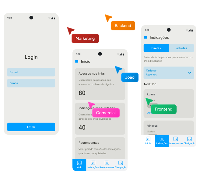
Low-fidelity prototyping using wireframe.
Usability Tests
After the prototype of the new version was validated internally, I conducted 5 remote and moderated tests with real users to evaluate usability.
We concluded that the new version of the product proved to be solid, but specific adjustments in nomenclatures, information architecture and visibility of key elements were considered essential to make the experience more intuitive and aligned with the users' mental model.


Usability test carried out remotely and moderately, using Google Meet.
User Interface Design (UI)
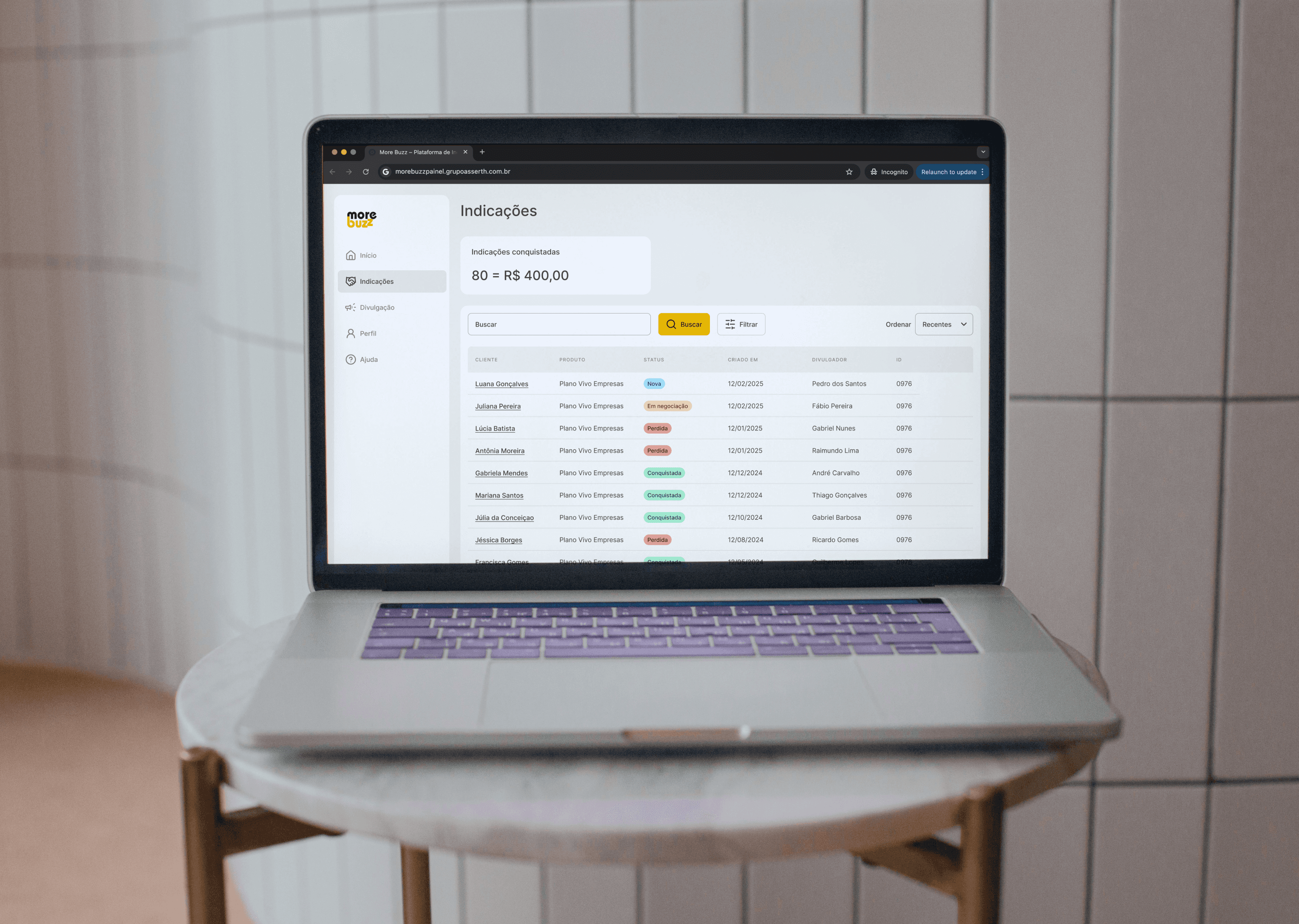
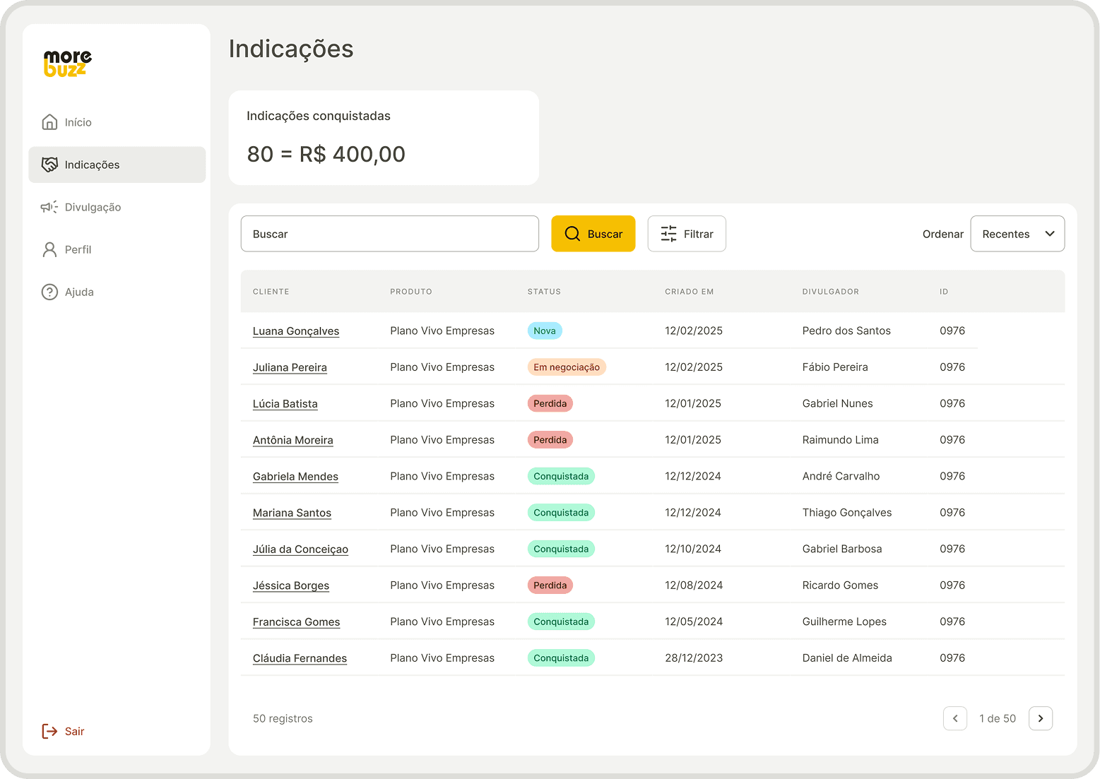
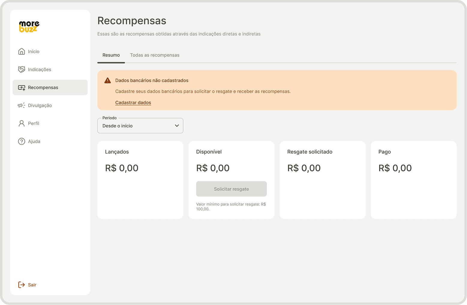
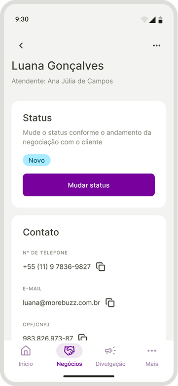
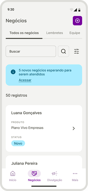
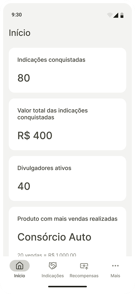
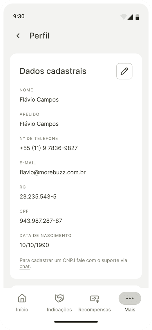
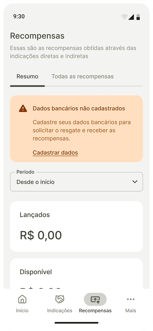
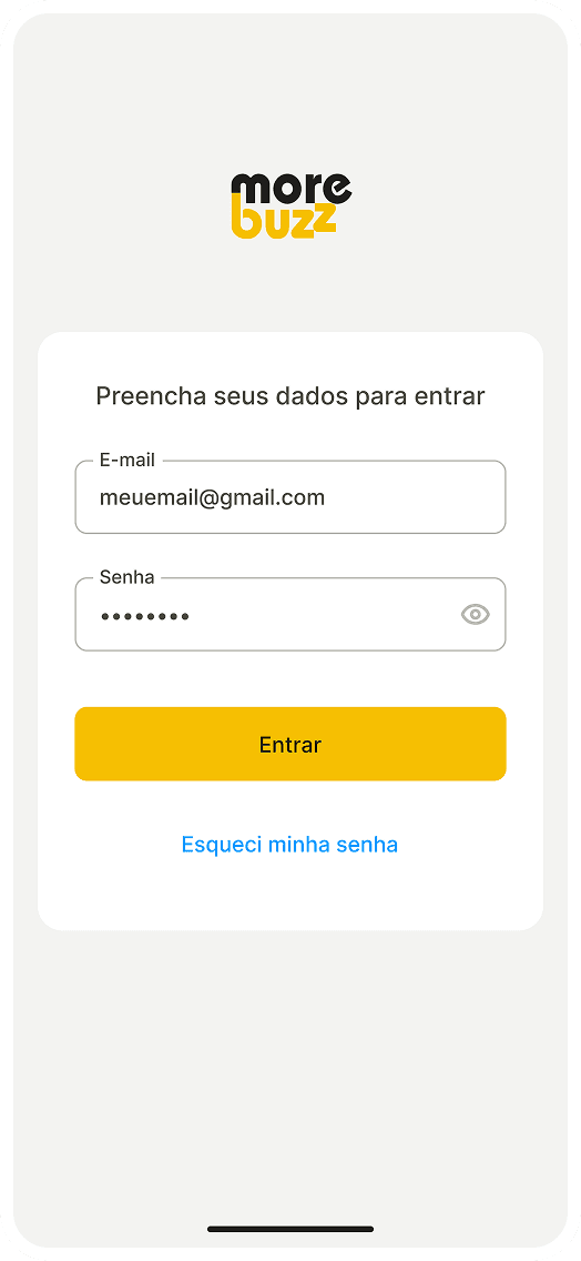
In the UI stage, I created a Style Guide with the primary visual elements of the product, establishing a standardized visual base for the creation of interfaces and ensuring the consistency and scalability of the product. From this base, I developed a library of reusable, responsive and scalable components, prepared to support future evolutions of the product and its white label strategy.

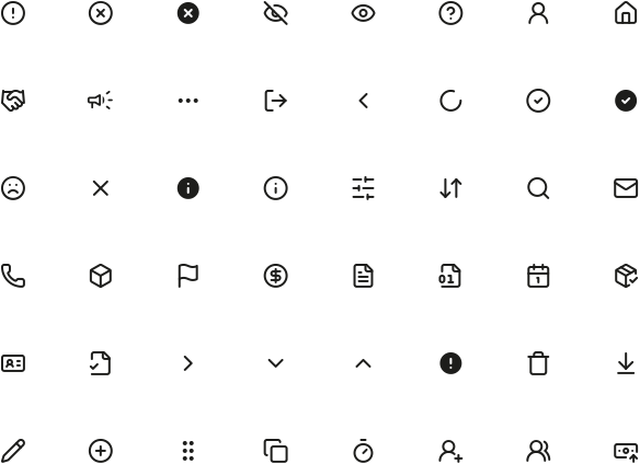
Product icons library.

Creation of the component library.
" height="20.833375000000004px" id="uFangEaQL" transform="translate(9.583 9.583)" width="20.83337499999999px"/></g></svg>)
" transform="translate(4 4)" width="32.000001483493406px"/></svg>)


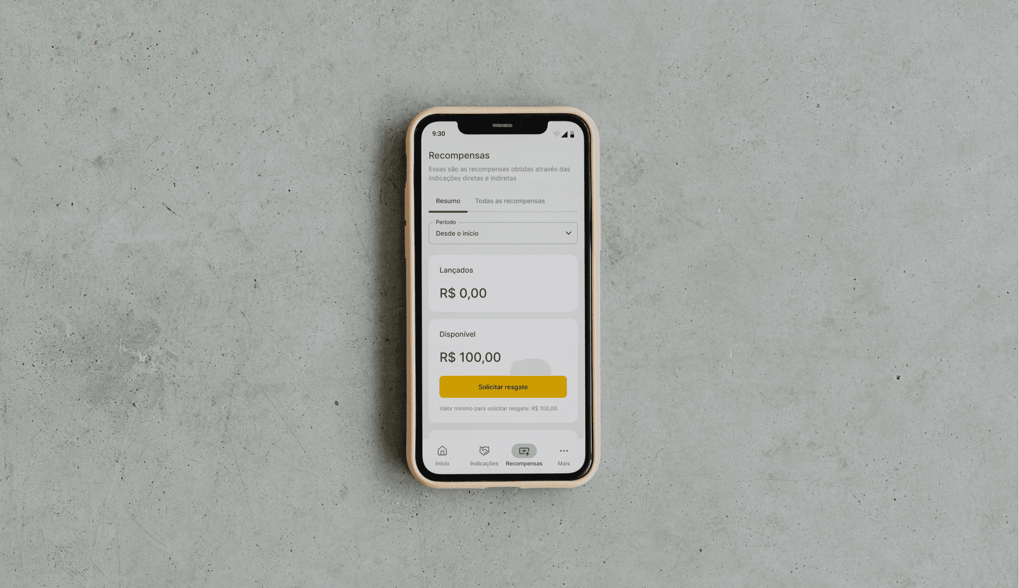
Key outcomes
" transform="translate(3.328 25)" width="23.33327142857148px"/><path d="M 0 0 C 1.43 0.371 2.696 1.205 3.599 2.373 C 4.503 3.541 4.994 4.976 4.994 6.453 C 4.994 7.93 4.503 9.365 3.599 10.533 C 2.696 11.701 1.43 12.536 0 12.907" fill="transparent" height="12.906657142857142px" id="a0GeKo9VD" stroke-dasharray="" stroke-linecap="round" stroke-linejoin="round" stroke-width="2.86" stroke="rgb(13, 150, 88)" transform="translate(26.672 5.218)" width="4.9937142857142405px"/><path d="M 5 9.783 L 5 6.45 C 4.999 4.973 4.507 3.538 3.602 2.371 C 2.697 1.203 1.43 0.369 0 0" fill="transparent" height="9.783428571428573px" id="PN9IBkizY" stroke-dasharray="" stroke-linecap="round" stroke-linejoin="round" stroke-width="2.86" stroke="rgb(13, 150, 88)" transform="translate(31.672 25.218)" width="5.0000000000000036px"/><path d="M 6.667 13.333 C 10.349 13.333 13.333 10.349 13.333 6.667 C 13.333 2.985 10.349 0 6.667 0 C 2.985 0 0 2.985 0 6.667 C 0 10.349 2.985 13.333 6.667 13.333 Z" fill="transparent" height="13.333285714285715px" id="qotDcFucS" stroke-dasharray="" stroke-linecap="round" stroke-linejoin="round" stroke-width="2.86" stroke="rgb(13, 150, 88)" transform="translate(8.328 5)" width="13.333271428571477px"/></svg>)
User adoption and retention
The new changes favored the increase and retention of users in the product.
" transform="translate(5 13.337)" width="16.666714285714274px"/><path d="M 0 3.333 C 0 2.449 0.351 1.601 0.976 0.976 C 1.601 0.351 2.449 0 3.333 0 L 23.333 0 C 24.217 0 25.065 0.351 25.69 0.976 C 26.315 1.601 26.667 2.449 26.667 3.333 L 26.667 30 C 26.667 30.884 26.315 31.732 25.69 32.357 C 25.065 32.982 24.217 33.333 23.333 33.333 L 19.333 33.333" fill="transparent" height="33.333371428571425px" id="eWBBEVlhU" stroke-dasharray="" stroke-linecap="round" stroke-linejoin="round" stroke-width="2.86" stroke="rgb(13, 150, 88)" transform="translate(8.328 3.337)" width="26.666599999999953px"/><path d="M 0 0 L 0.017 0" fill="transparent" height="1px" id="viXPxUcla" stroke-dasharray="" stroke-linecap="round" stroke-linejoin="round" stroke-width="2.86" stroke="rgb(13, 150, 88)" transform="translate(13.328 30)" width="1px"/></svg>)
Responsive Product
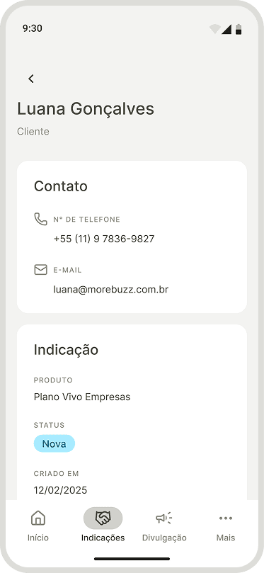
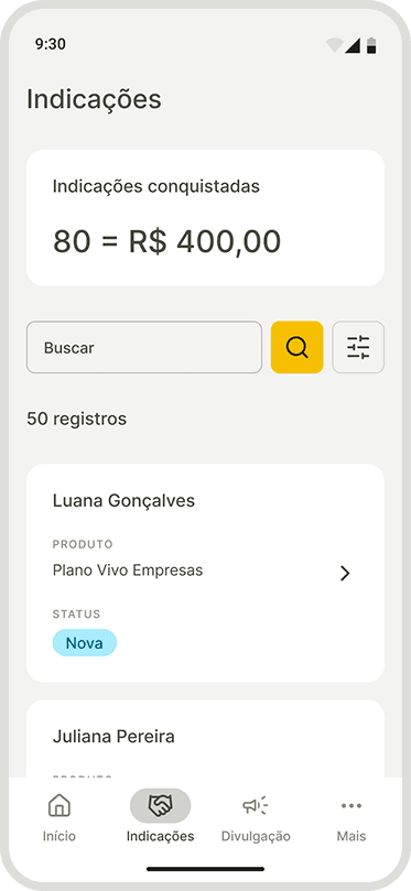
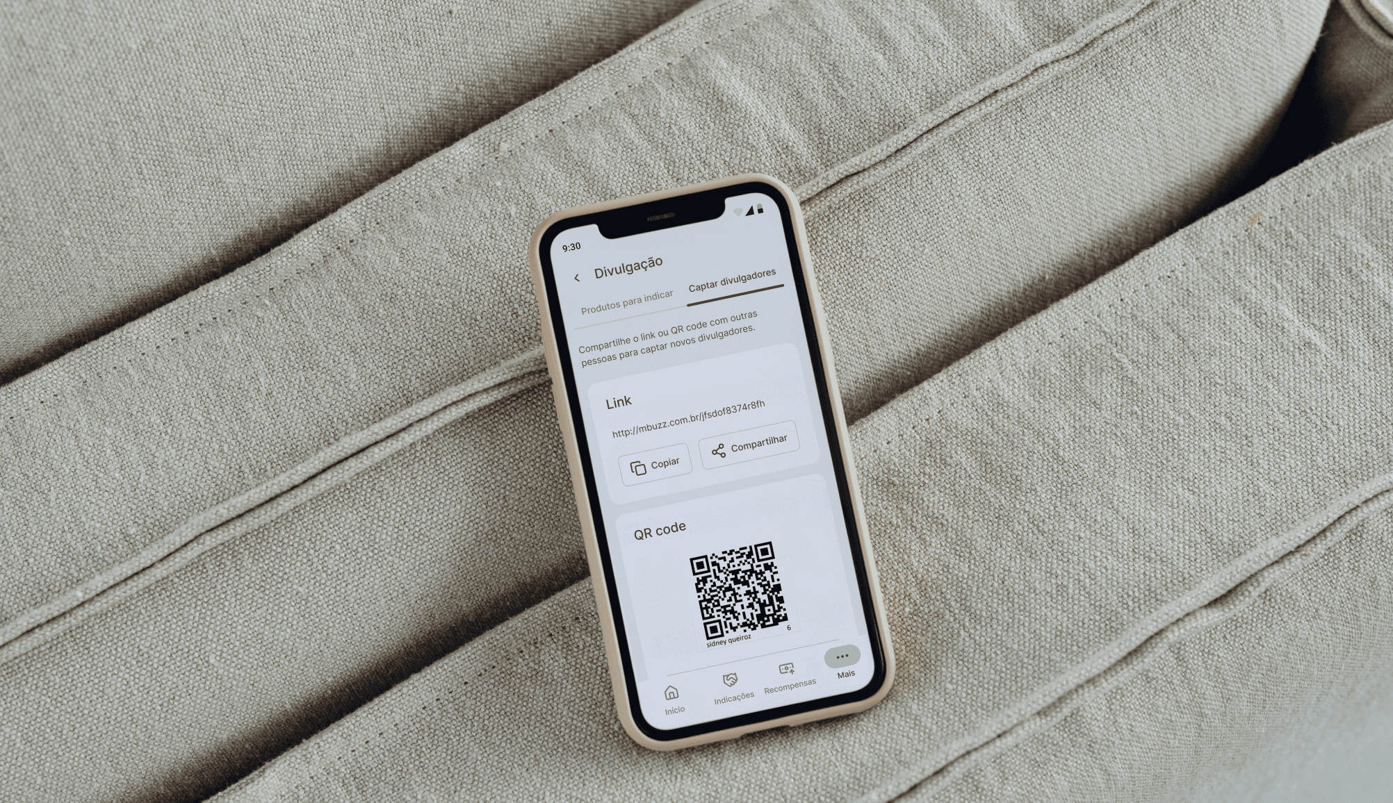
The experience has been adapted for mobile devices without losing consistency with the desktop environment.
" transform="translate(6.672 3.337)" width="26.66672857142853px"/><path d="M 0 0 L 0 6.667 C 0 7.551 0.351 8.399 0.976 9.024 C 1.601 9.649 2.449 10 3.333 10 L 10 10" fill="transparent" height="10px" id="sdLa4WDbh" stroke-dasharray="" stroke-linecap="round" stroke-linejoin="round" stroke-width="2.86" stroke="rgb(13, 150, 88)" transform="translate(23.328 3.337)" width="10.000000000000004px"/><path d="M 0 3.333 L 3.333 6.667 L 10 0" fill="transparent" height="6.666571428571434px" id="Wfvq4VyLJ" stroke-dasharray="" stroke-linecap="round" stroke-linejoin="round" stroke-width="2.86" stroke="rgb(13, 150, 88)" transform="translate(5 21.663)" width="10px"/></svg>)
White label
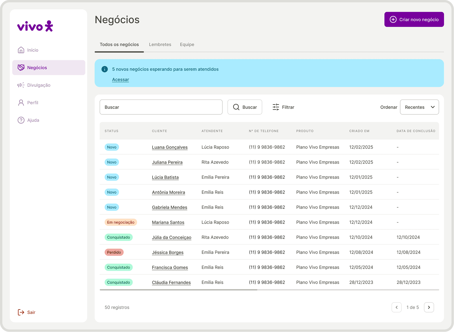
The product has been rebuilt with a neutral visual and textual language to make it possible for other brands to use.
" transform="translate(20 5)" width="13.33328571428573px"/><path d="M 0 1.667 C 1.238 0.738 2.71 0.173 4.252 0.034 C 5.793 -0.105 7.343 0.188 8.727 0.88 C 10.111 1.572 11.275 2.636 12.089 3.952 C 12.902 5.269 13.333 6.786 13.333 8.333 C 12.095 9.262 10.623 9.827 9.082 9.966 C 7.54 10.105 5.991 9.812 4.607 9.12 C 3.222 8.428 2.058 7.364 1.245 6.048 C 0.431 4.731 0 3.214 0 1.667 Z" fill="transparent" height="10.000058285943764px" id="YR4gsRj8U" stroke-dasharray="" stroke-linecap="round" stroke-linejoin="round" stroke-width="2.86" stroke="rgb(13, 150, 88)" transform="translate(6.672 13.337)" width="13.333299999999978px"/><path d="M 0 0 L 23.333 0" fill="transparent" height="1px" id="RYyMfktGE" stroke-dasharray="" stroke-linecap="round" stroke-linejoin="round" stroke-width="2.86" stroke="rgb(13, 150, 88)" transform="translate(8.328 35)" width="23.33327142857148px"/></svg>)
Scalable consistency
The style guide and components have created a design foundation that makes it easy to maintain and evolve the product.
Adherence to users' mental model
The tests revealed needs and expectations, making the product more aligned with the users' mental model.
" width="12px"><path d="M 9.98 10.977 L 9.98 1.996 L 0.998 1.996 C 0.447 1.996 0 1.549 0 0.998 C 0 0.447 0.447 0 0.998 0 L 10.977 0 C 11.529 0 11.975 0.447 11.975 0.998 L 11.975 10.977 C 11.975 11.529 11.529 11.975 10.977 11.975 C 10.426 11.975 9.98 11.529 9.98 10.977 Z" fill="rgb(255, 255, 255)" height="11.975424446415929px" id="TAkCTIb4j" width="11.975424446416127px"/><path d="M 10.284 0.305 C 10.535 0.045 10.906 -0.059 11.255 0.033 C 11.604 0.124 11.876 0.396 11.967 0.745 C 12.059 1.094 11.955 1.465 11.695 1.716 L 1.716 11.695 C 1.465 11.955 1.094 12.059 0.745 11.967 C 0.396 11.876 0.124 11.604 0.033 11.255 C -0.059 10.906 0.045 10.535 0.305 10.284 Z" fill="rgb(255, 255, 255)" height="12px" id="meAnXRyQ2" width="12px"/></g></svg>)